On your phone#
The phone app is not a companion app. It is the same app: the same projects, the same issues, the same comments, the same settings, built from one codebase for every platform. Nothing is missing because you are on a small screen.
What does change is the shape. A navigation rail becomes a bottom bar, a table becomes a stack of cards, and a couple of interactions that assume a mouse are replaced with ones that assume a thumb. This page covers those differences, and is honest about the two or three things a desktop still does better.
Getting around#
The rail on the left of the desktop layout is gone. In its place:
- Four tabs along the bottom, floating on a pill of frosted glass: Home, Issues, Board and More.
- A separate round search button, detached from the tab pill at the bottom
right. It opens the same command palette as
⌘Kon a desktop — type to jump to an issue, a project, a person or a page. - A slim top bar with the page title, the bell and the settings icon.
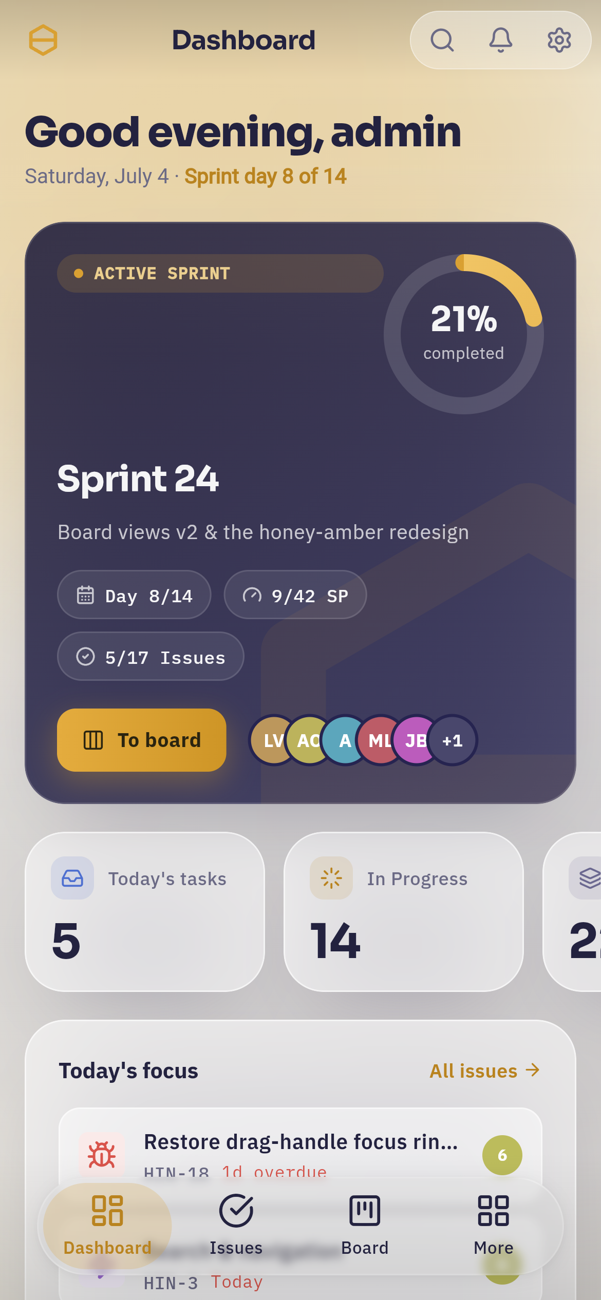 Home on a phone. The greeting and sprint day are at the top, the active sprint sits on a navy card with its completion ring and a "To board" button, then the stat tiles and Today's focus. The four-tab glass pill and the round search button float above the content at the bottom; the bell and settings sit top-right.
More opens a sheet with everything the four tabs do not cover.
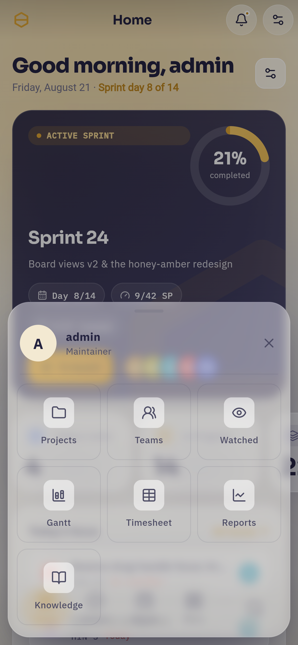 The More sheet: your name and avatar at the top, then a grid of seven destinations — "Projects", "Teams", "Watched", "Gantt", "Timesheet", "Reports" and "Knowledge". Notifications is not among them.
Whenever you are on one of those pages, More stays lit as the active tab, so you always know where you are. Notifications gets no entry of its own on purpose: the bell is on every screen already, and a second door to the same room would only be one more line to scan past.
Content scrolls behind the glass, not under a bar
Both the top bar and the bottom pill are translucent and float above the page. Content slides underneath them and stays readable through the blur, which is why the app feels taller than the screen it is on.
Gestures worth knowing#
| Gesture | What it does |
|---|---|
| Swipe in from the left edge | Goes back — the same as the back arrow, including stepping back through settings sections |
| Pull down | Refreshes the page you are on |
| Swipe a notification right | Toggles it between read and unread |
| Swipe a notification left | Deletes it |
| Long-press an issue row | Enters multi-select, so you can act on several at once |
| Long-press a comment | Opens its menu: reply, react, copy link, pin, edit, delete |
The edge swipe only claims a narrow strip on the left, which is what lets the board, the Gantt chart and the timeline keep scrolling sideways everywhere else on the screen.
When the network drops#
Hinata is a live client, not an offline notebook. Everything you see comes from your server as you look at it, which is why two people editing the same issue on two phones see each other's changes appear without either of them refreshing.
The trade is that a tunnel or a dead lift means no data. When a request cannot reach the server the app says so — Could not reach the server. Please check your connection. — rather than showing you something stale and letting you act on it. Pull down to refresh once you have signal again, or just navigate; the next screen fetches fresh.
Write it before you lose signal
If you are heading somewhere with no reception, take the photo and write the comment before you go underground, and send it while you still have a bar. A composer left open does not queue and resend on its own.
The issue list on a phone#
The desktop shows issues as a table. A phone shows them as cards, because a table with six columns on a 390-point screen is a table you cannot read.
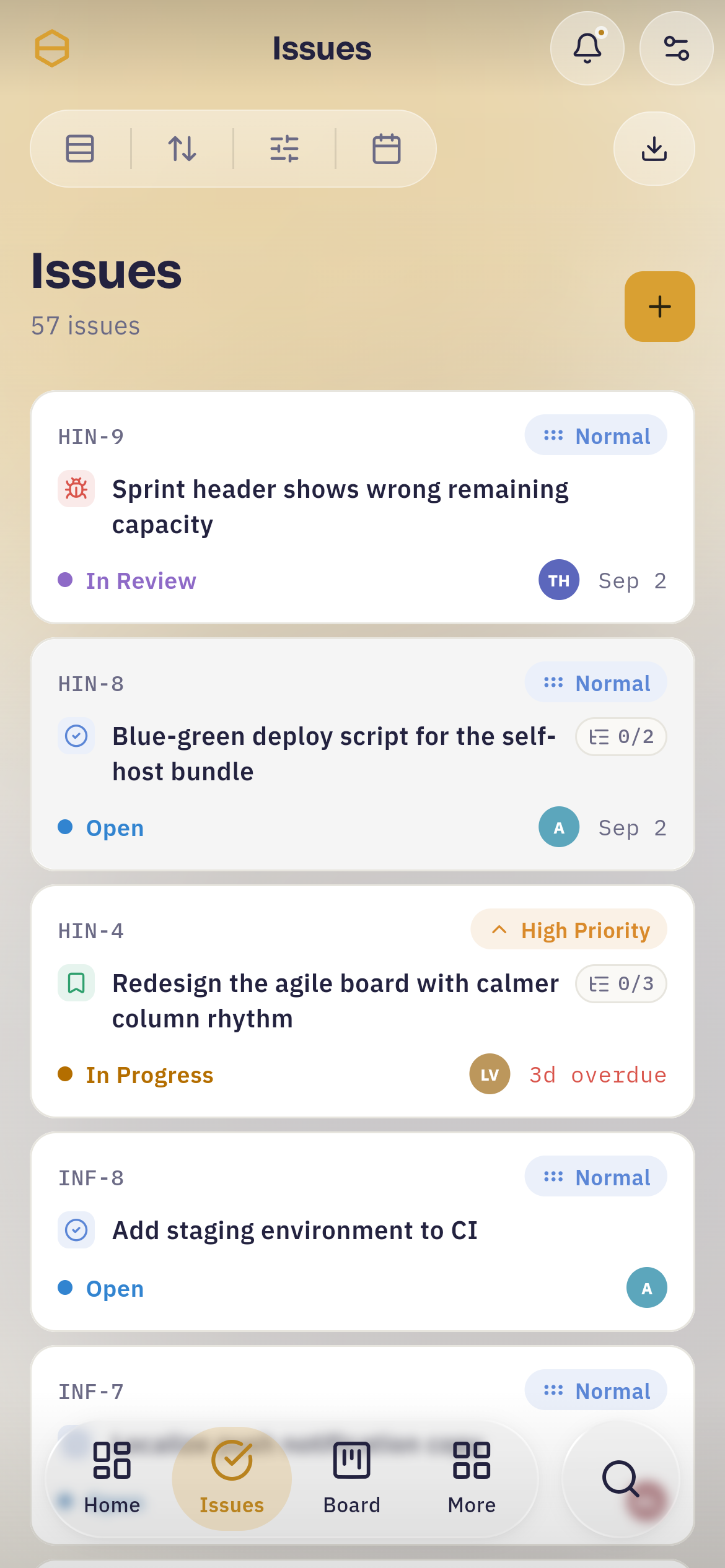 Issues on a phone. The four view controls — grouping, sort, filter and time range — collapse into one connected glass bar at the top, with the export button beside it. Each issue is a card: key and priority on the first line, type and title on the second, state, assignee and an overdue note on the third. The amber "+" creates a new issue.
The four controls that sit as separate labelled pills on a desktop collapse into one segmented glass bar, so they read as a single cluster instead of four scattered boxes.
The amber + button creates an issue. Long-press any card to start selecting, then act on the whole selection at once.
The board on a phone#
A board column is 300 points wide, and that is what it stays on a phone — a narrower column starts breaking the card's meta line, and a board of unreadable cards is not more board. So instead of squeezing columns, the phone shows you one at a time.
The wall snaps. Flick sideways and it comes to rest on a column boundary rather than wherever your finger let go. On a screen that only ever holds one column, stopping halfway between two of them tells you nothing and costs you a re-aim.
The view switcher goes icons-only and moves to the right, because the labels were eating the width the row shares with the other controls.
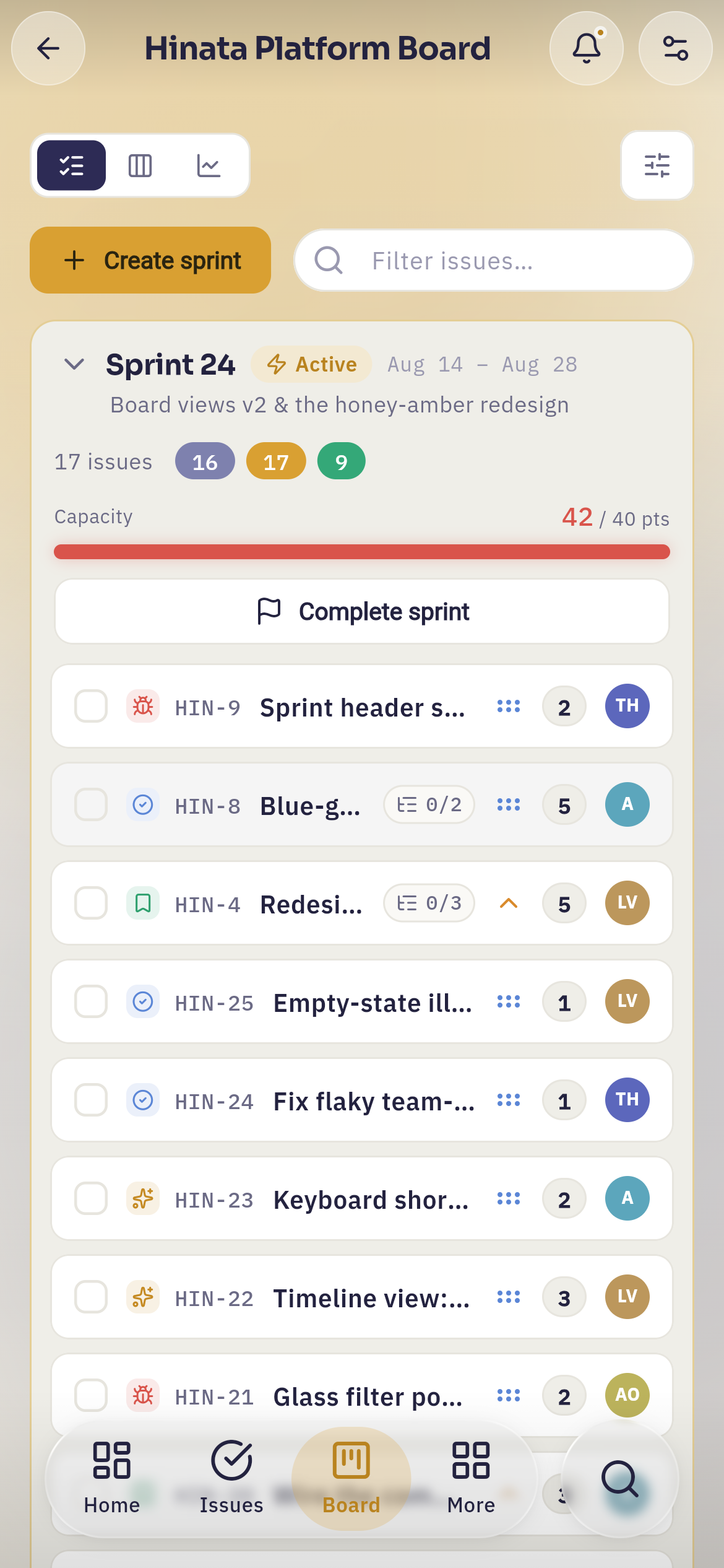 A Scrum board's backlog view on a phone. The three view icons sit top-left with the filter button opposite; below them "Create sprint" and a filter field. The sprint header shows its dates, issue count, capacity — 42 of 40 points here, so the bar is red — and a "Complete sprint" button. Each row has a round checkbox for selecting several at once.
Cards do not drag on a touch screen
Dragging a card between columns is a mouse gesture. On a phone it fights the board's own sideways scroll, and the result is a card that jumps when you meant to scroll and a board that scrolls when you meant to move a card. So the app does not offer it.
Move an issue instead by opening it and changing its state — one tap more, and it never misfires. To plan a sprint, tick the round checkboxes on the rows you want and use Move to… in the bar that appears at the bottom. It lists this board's sprints and Backlog, and it handles ten issues faster than dragging would have handled one.
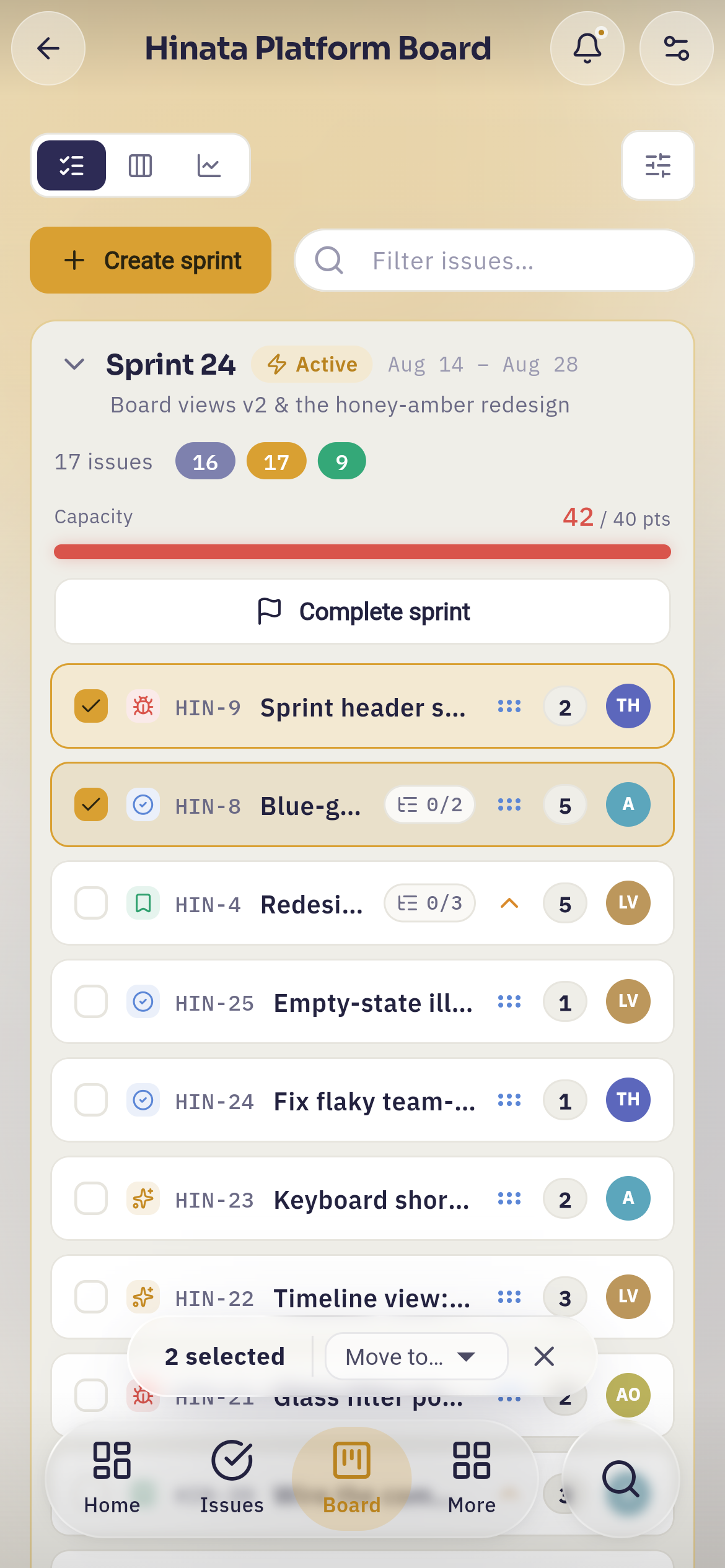 Two rows ticked. The selected rows are outlined in amber, and a "2 selected" bar docks above the tab pill, carrying the Move to… picker and an ✕ that clears the selection again.
The add issue button at the foot of each column, which stays hidden until you hover on a desktop, is always visible here — there is no hover to reveal it with.
Working inside an issue#
Opening an issue on a phone gives you the whole screen: every panel that sits beside the description on a desktop — sub-tasks, linked issues, attachments, details — stacks into one scroll.
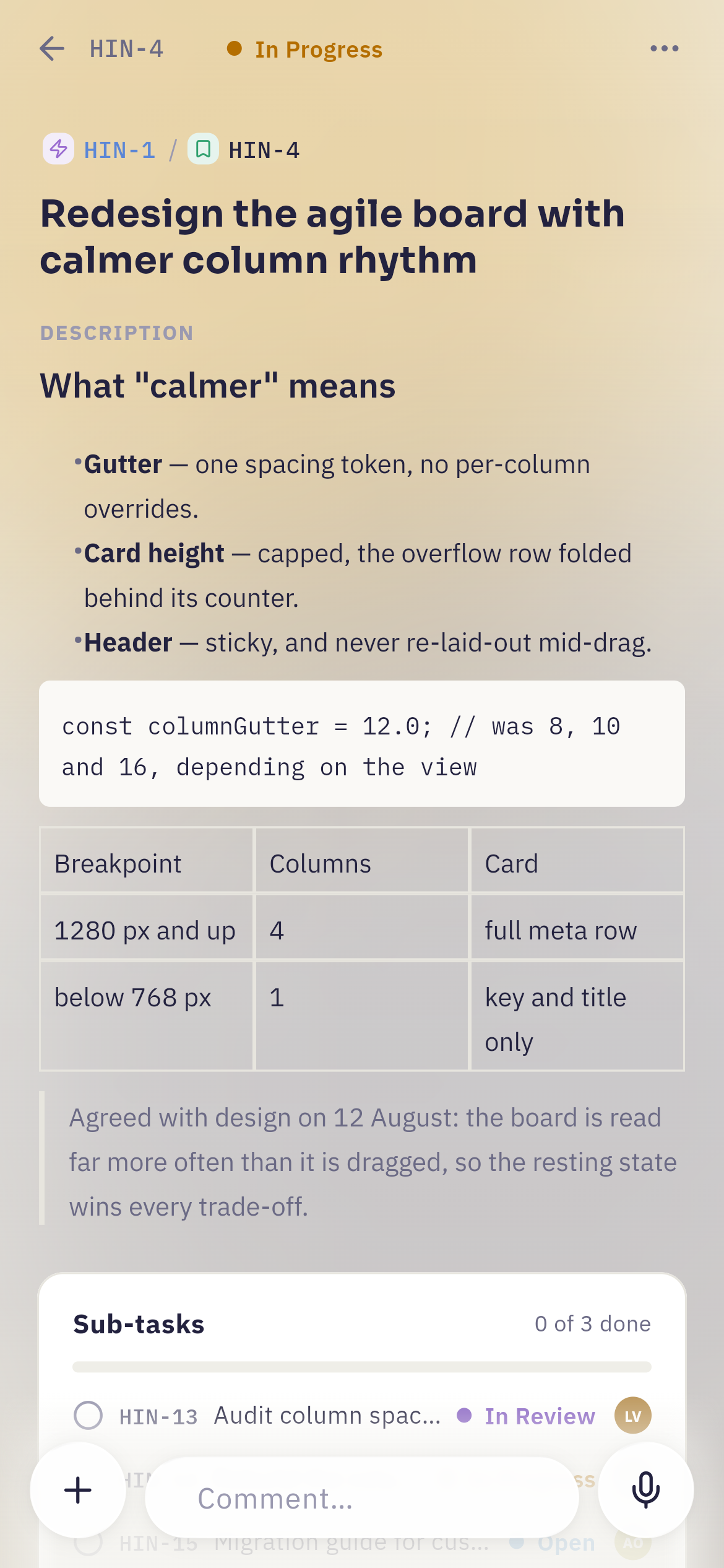 An issue on a phone. The description renders in full — headings, lists, a code block, a quote and a table — the Sub-tasks panel follows underneath, and the comment composer stays docked at the bottom with its "+" button, the "Comment…" field and the microphone.
The composer stays docked at the bottom while you read, so replying never means scrolling to the end first. Start typing and the microphone becomes the amber send button.
Attaching a photo#
Two controls, two different menus.
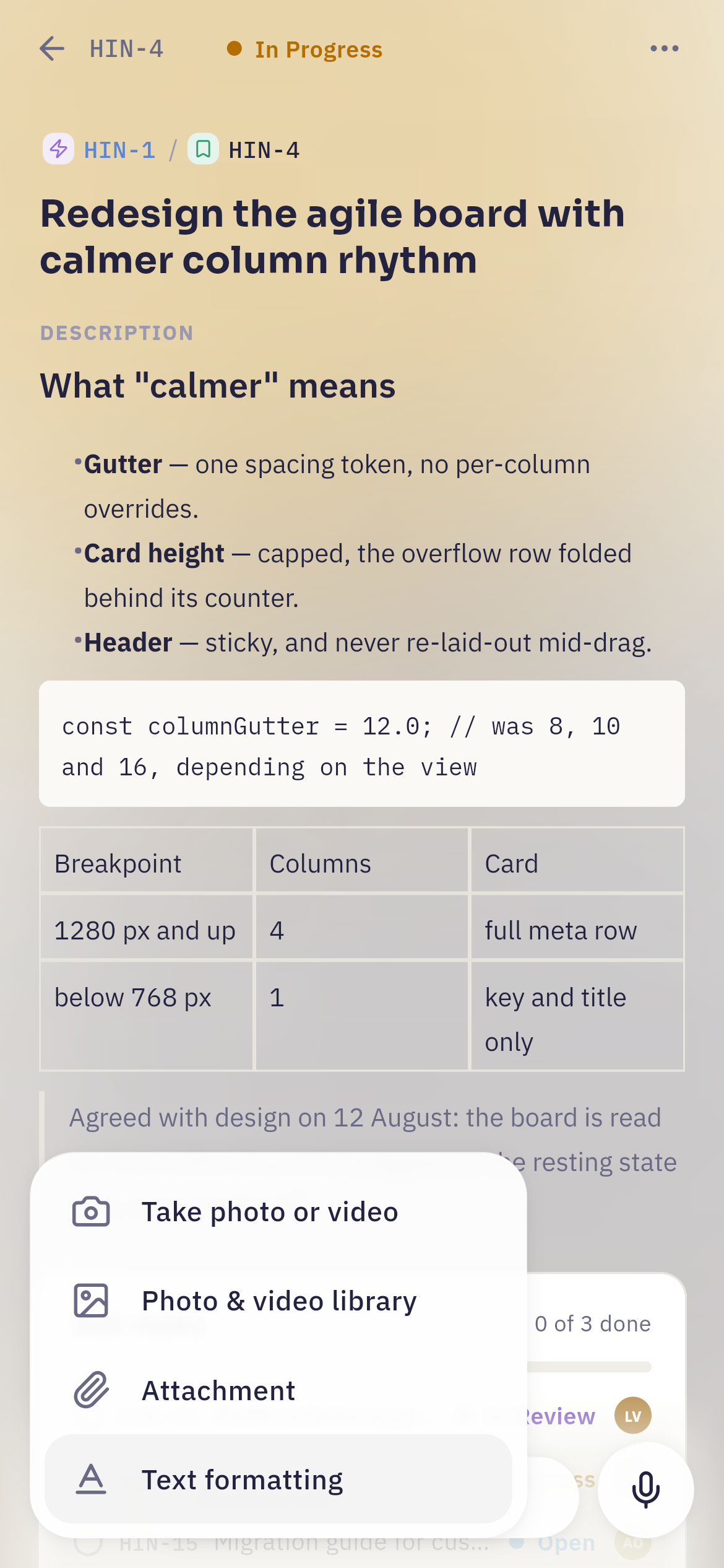 The "+" beside the comment field opens four rows: "Take photo or video", "Photo & video library", "Attachment", and "Text formatting" — the last one formats what you are typing rather than attaching anything.
Add files on the attachments panel opens the system source sheet instead: Photo Library for several photos or videos at once, Take Photo and Record Video for the camera, and Choose File for PDFs, documents and archives.
This is the difference that matters most in practice. A bug you can photograph is a bug you have already half-reported: take the picture at the machine, in the room, on the shelf, and it is attached before you have finished describing it.
Uploads have a size limit, which the attachment panel states plainly under its drop area; if a file is over it, the app names the file rather than failing silently.
Downloads go through the share sheet
Downloading an attachment on a phone opens the system share sheet — Save to Files, AirDrop, mail, whatever else you have. You choose where it lands instead of hunting through an app-private folder afterwards.
Voice comments on the go#
Tap the microphone and the composer morphs into a recorder with a live waveform, so you can see it is hearing you. Cancel or send. What you send appears in the thread as a waveform bubble alongside the text comments, and the waveform others see is the one you watched while recording.
The first recording asks for the microphone permission. If you decline, the app says the recording needs it rather than failing quietly.
Good for context, not for decisions
Thirty seconds of "here is what I found and why it is odd" is far faster spoken than typed one-handed. But a decision that people will need to find again in three months should be typed — text is searchable, quotable and skimmable, and a voice note is none of those.
Push notifications#
The app asks for notification permission once, the first time you sign in. Say yes and Hinata can reach you when the app is closed.
Tapping a push takes you to the exact screen it is about — the issue, the comment, the weekly summary — not to the dashboard. That holds even when the app was not running: the launch link is read before anything slow happens, held, and followed as soon as the app is ready. And it is followed once, so relaunching later does not drag you back to a week-old notification.
Push works on Android, iOS, macOS and Windows. Download has the full table of what each platform can do.
Your settings follow you, not your device
Which events are allowed to push you is a setting on your account, so you can adjust it from your laptop and the change applies to your phone. Staying informed walks through the grid.
Several servers, one app#
Hinata apps ship with no server address inside them. The one you installed from the store is the same app your colleague installed, and it connects to whatever server you point it at.
That means one app can serve several: work, a club, a test instance. Each server keeps its own sign-in on the device — signing out of one does not touch the others.
Open Settings → Manage servers to see them all.
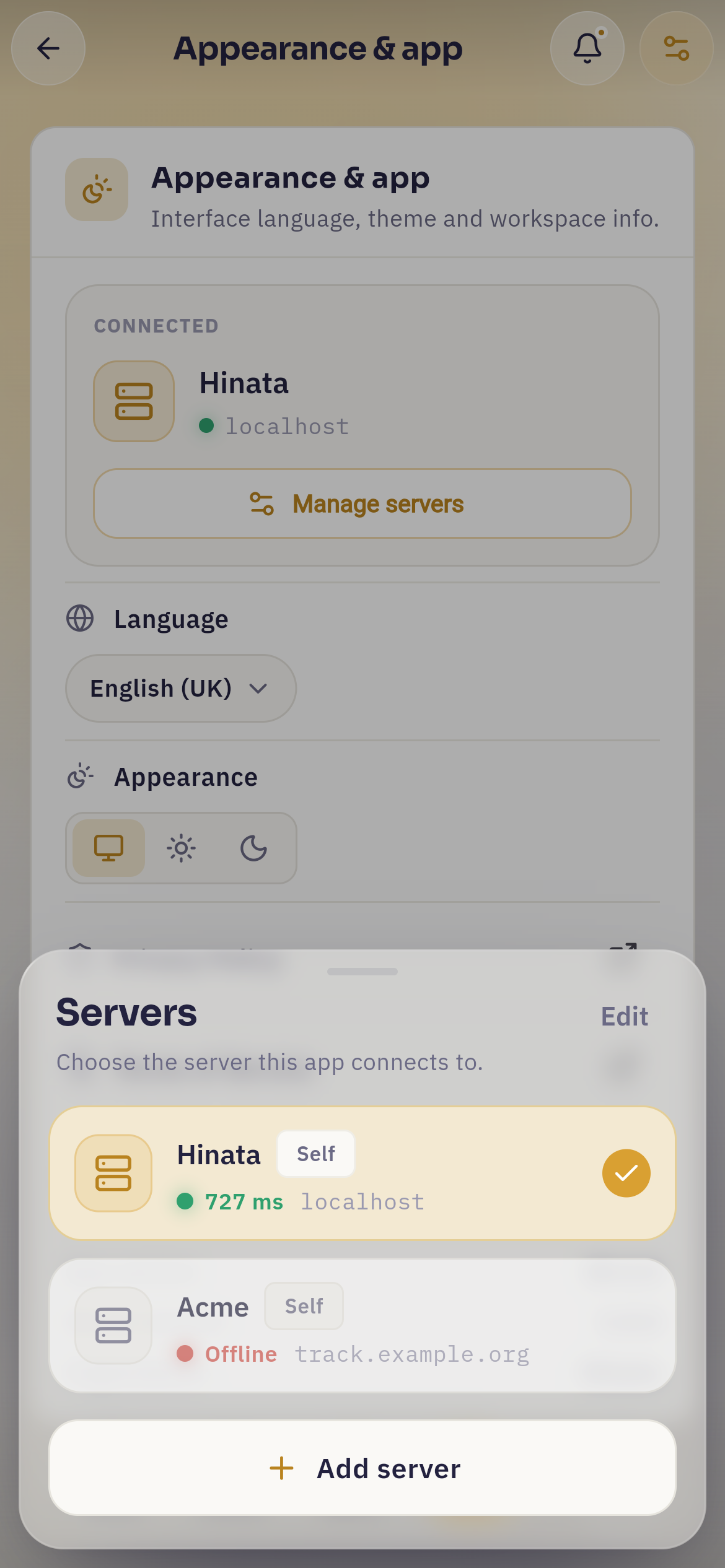 The manager sheet. Every saved server is probed as the sheet opens, so one row reports its round trip in milliseconds while the other reports "Offline"; the check marks the one in use. "Edit" at the top turns the rows into rename and remove controls.
From there you can:
- Switch to another one — the whole app changes over, with the new server's organisation name and logo.
- Add a server by URL. Hinata tests the address before saving it, and reports what it found: reachable or not, TLS valid or absent, and the round trip in milliseconds. You cannot end up half-connected to something that is not a Hinata server.
- Rename one, so "work" and "club" are easier to tell apart than two URLs.
- Remove one. This forgets the saved sign-in on this device; it changes nothing on the server.
Staying signed in
Your sign-in is kept in the phone's own protected storage — the Keychain on iOS, encrypted storage on Android — not in plain preferences. That is why the app comes back signed in after a restart, and why signing out from Active sessions on another device genuinely locks this one out.
What is still easier on a big screen#
Being honest about this is more useful than pretending otherwise:
- Dragging cards between columns does not exist on touch, as above.
- The Gantt chart and the timesheet grid are dense, wide surfaces. They work on a phone — they scroll — but a week of time entries or a quarter of dependencies is genuinely easier to read across a laptop screen.
- Reports show more of a chart at once with more room.
- Writing long descriptions with the full formatting toolbar and keyboard shortcuts is faster on a keyboard, whatever the device.
What the phone is better at is everything that happens away from the desk: attaching a photo of the actual problem, dictating context on the walk back, triaging your notifications in a queue, and moving an issue on before you forget about it.
Next steps#
- Getting started — signing in and finding your way around, on any device.
- Boards & sprints — what the columns mean and how a sprint runs.
- Comments & attachments — mentions, threads, reactions and voice notes in full.
- Staying informed — tuning what actually reaches your phone.
- Download — where to get the app for every platform.