Reports & dashboard#
Two screens turn the work you are already tracking into something you can read. The dashboard is personal and answers what should I do next?; it is the screen you land on every morning. Reports is shared and answers how is this project actually going?
Neither asks you to enter anything extra. Both are only as honest as the issues underneath them — which is the theme of this page.
Your dashboard#
Home in the sidebar. It opens with your name, today's date, and — if a sprint is running — which day of it you are on.
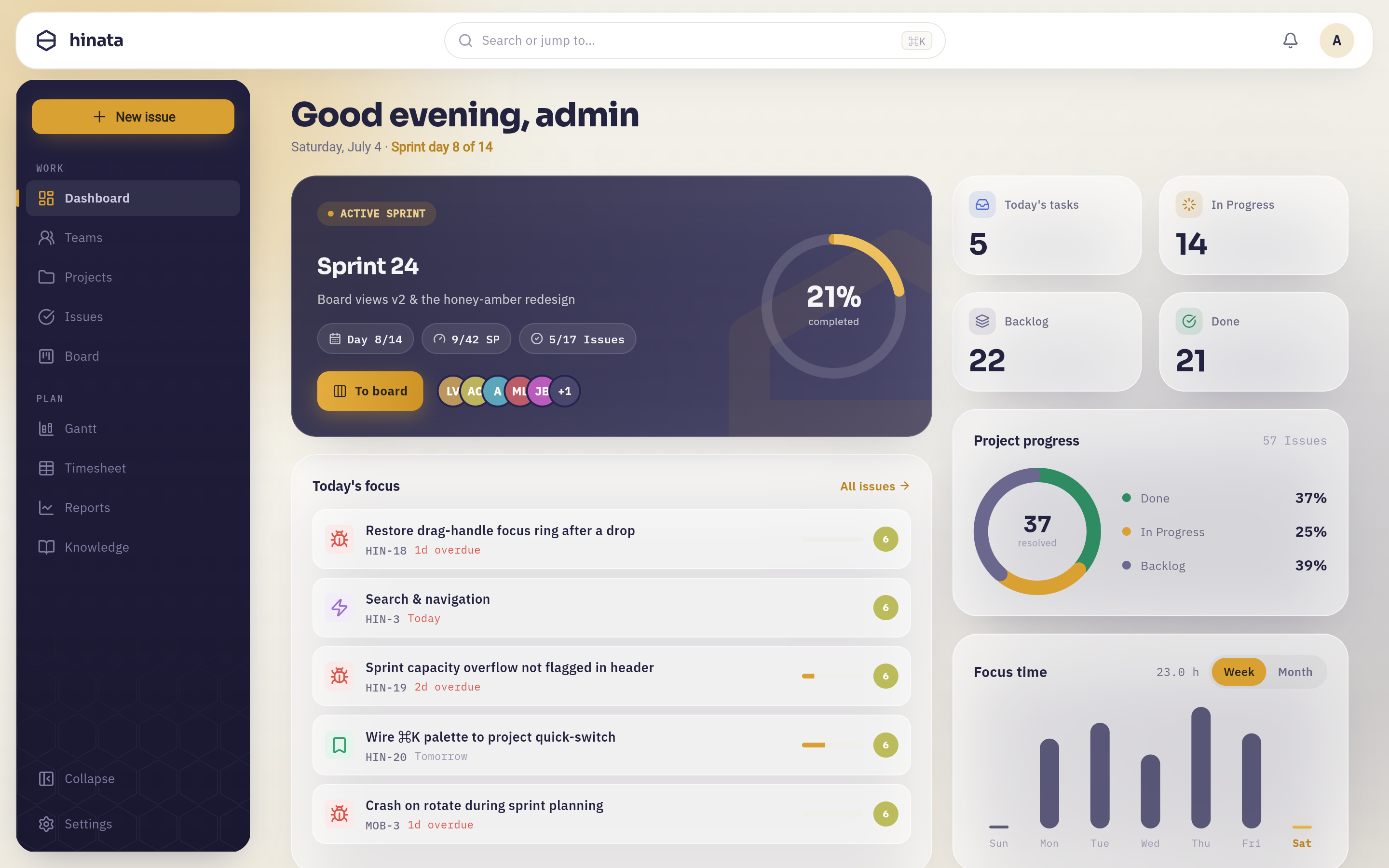 The dashboard. The dark card at the top is the running sprint; the four small tiles on the right are counts you can click through to; the donut and the bar chart below them summarise the project and your own week.
The active-sprint card#
The large dark card is whichever board matters to you right now. When a Scrum board has a sprint running, you get the sprint: its name, its goal underneath, and three chips: the day you are on in the sprint's calendar, story points completed out of story points committed, and issues finished out of issues in the sprint.
The ring on the right is the same story as a single percentage, and the row of avatars is who has issues assigned in this sprint. To board takes you straight there.
If no sprint is running, the card falls back to a Kanban overview of a board, with progress driven by issue completion instead of points. If you have no board at all, it offers to plan a sprint.
Pin the board you care about
By default the card picks the first running sprint it finds among your projects. If you work across several, use Customize to pin one board so the card stops changing under you.
The four key figures#
The small tiles are counts, and each one is a link — tapping it opens the Issues list already filtered to exactly the set that was counted, in the same projects.
| Tile | What it counts |
|---|---|
| Today's tasks | Your open issues that are due today or already overdue, ordered by priority. |
| In Progress | Every issue in scope that has started but is not done and is not in the backlog. |
| Backlog | Every issue in scope still sitting in Backlog or Open. |
| Done | Every issue in scope in one of your project's resolved states. |
Only the first tile is about you
Today's tasks counts your own work. The other three count the whole team's, across every project in the dashboard's scope. A Backlog of 33 is not 33 things waiting for you.
Today's focus#
The list underneath is the same set as the first tile — your open issues due today or overdue — highest priority first, showing the first five. Each row gives you the issue type as a glyph, the title, the key, and how overdue it is in red. The thin bar to the right is time spent against the issue's time estimate, where one exists.
Tap a row and the issue opens over the dashboard; close it and you are back where you were. All issues → opens the full filtered list.
If the list is empty you get "No urgent tasks for today — enjoy!", which is a real answer and not a placeholder.
Project progress#
The donut is a completion breakdown across every project in scope. The number in the middle is the percentage resolved; the legend splits the same total into Done, In Progress and Backlog, with the total issue count in the corner.
Read it as a shape rather than a number. A backlog slice that dominates the ring means intake is outrunning delivery — which is worth knowing long before a deadline says so.
Focus time#
Your logged hours, and only yours. Seven bars for the last seven days with today's bar in amber, a total in hours at the top, and a Week / Month toggle that re-buckets the same data into the last five calendar weeks.
It reads 0.0 h until somebody logs work — see Tracking your time
for how the entries get there, and note that time recorded through a Git commit
does not reach this chart.
Team ranking and Git activity#
Two further cards, both off to the side of the daily job:
- Team ranking counts issues resolved in the last 30 days per person, top ten. It is a light-hearted card, and it deliberately counts issues rather than hours — nothing here rewards logging more time.
- Git activity lists recent commits, pull requests and merges across the repositories your projects are connected to. It only appears if an administrator has set up Git integration.
Customize#
Customize in the top-right turns the dashboard into an editable layout.
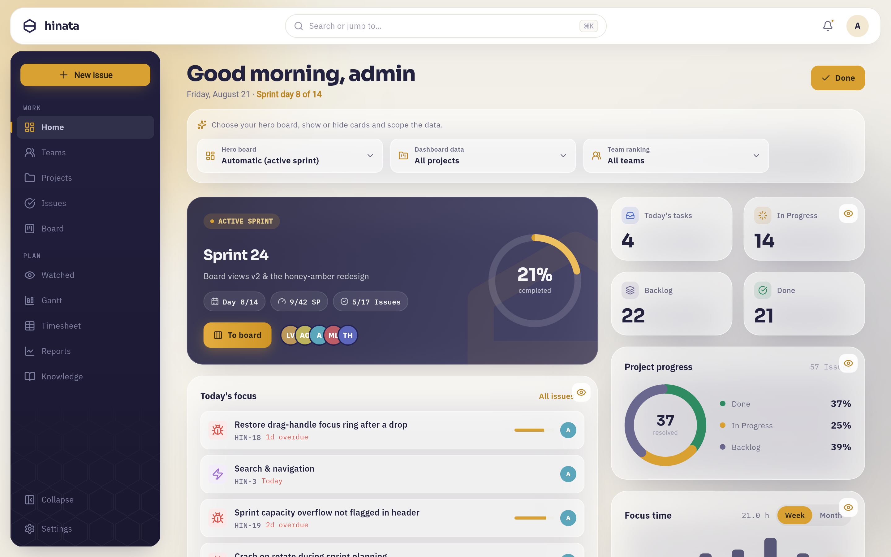 Edit mode. A hint strip and three fields sit above the cards — "Hero board", "Dashboard data" and "Team ranking" — every card grows an eye button that hides it, and the amber "Done" has taken the place of "Customize".
Scoping Dashboard data is the setting that moves the numbers: restrict it to your own projects and the key figures, the donut and Today's focus stop counting work you have no part in.
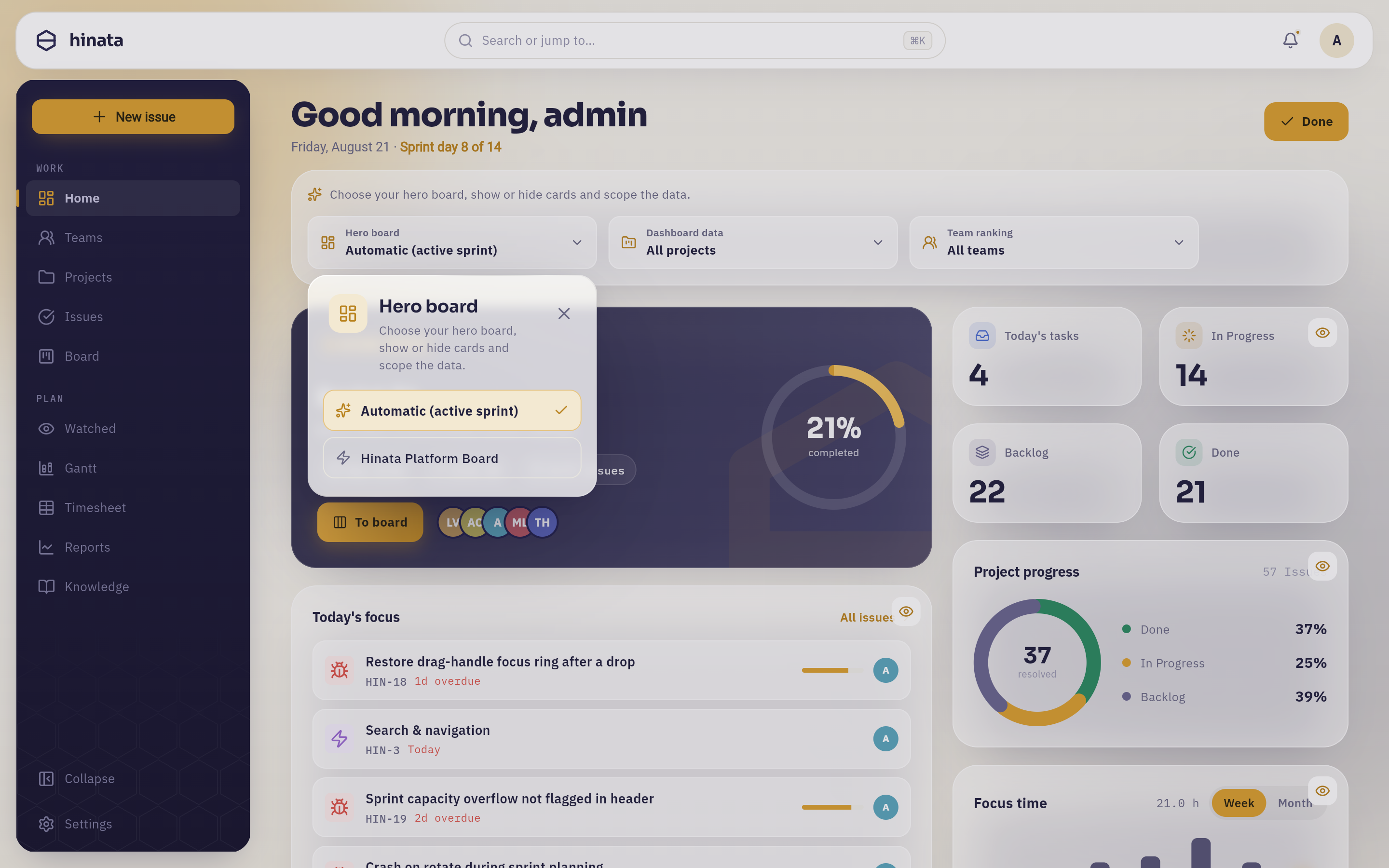 The "Hero board" field opens an anchored popover. "Automatic (active sprint)" carries the check; under it stands every board you can reach, here "Hinata Platform Board".
Press Done to save. The layout belongs to your account rather than to this device, so it follows you to your phone — and leaving the page without pressing Done throws the changes away.
Reports#
Reports in the sidebar, or behind More on a phone. Reports look at one project at a time.
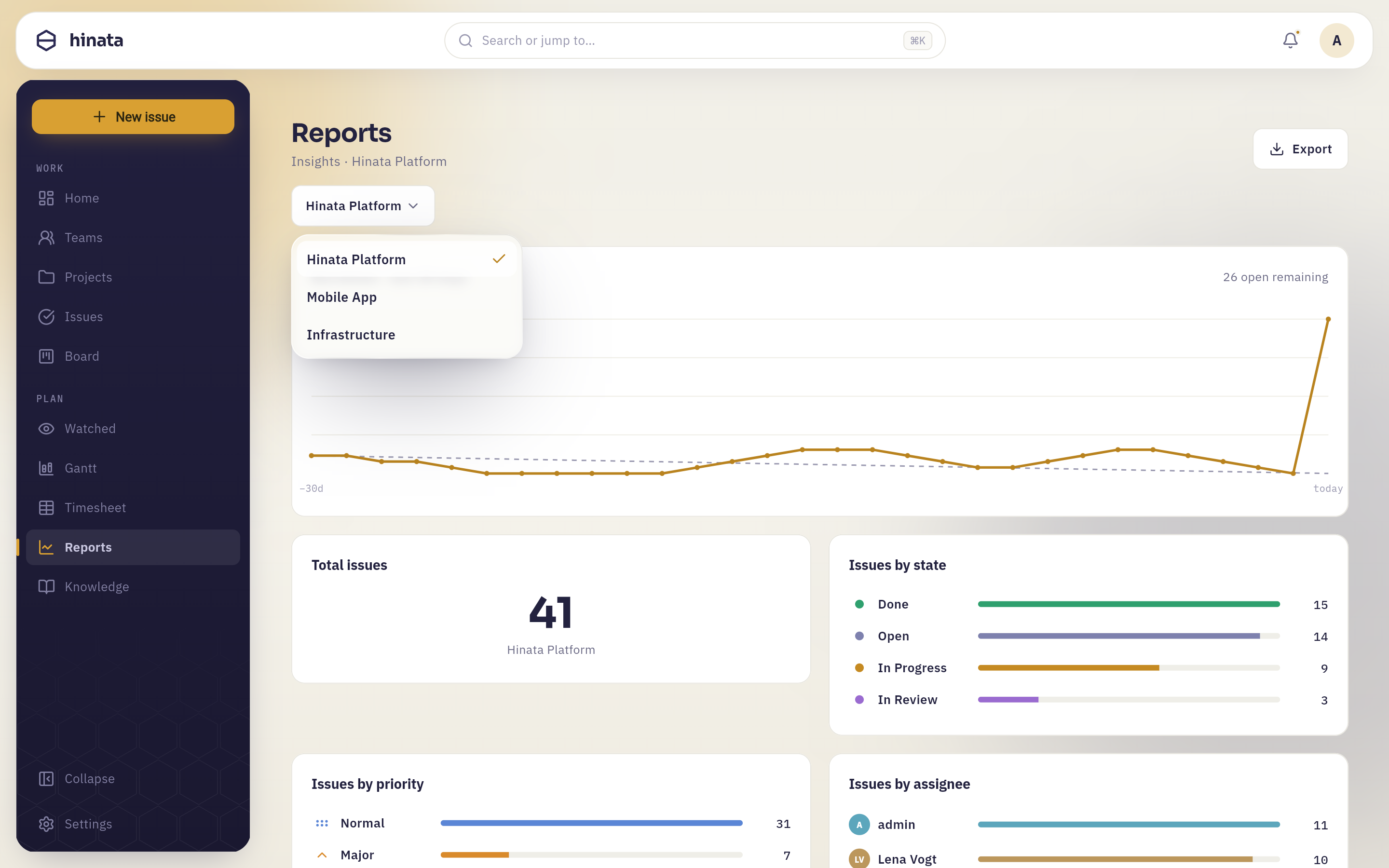 The picker under the heading, open. It lists only the projects your team access grants you, with a check on the one on screen; picking another redraws every card on the page.
Burndown · last 30 days#
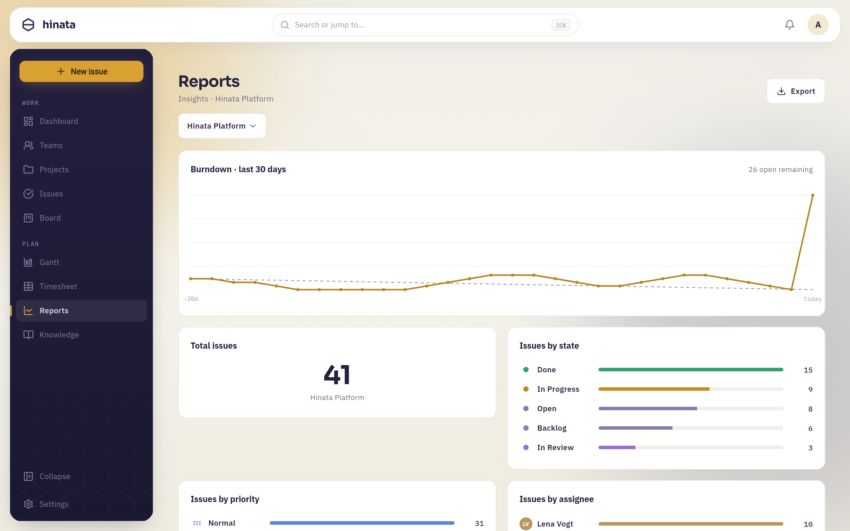 The top of the page. The amber line is open issues on each of the last 30 days against a dashed ideal, with today's count in the corner; "Total issues" and "Issues by state" sit underneath.
The amber line is how many issues were open on each of the last 30 days, anchored to today's real open count and reconstructed backwards from when issues were created and resolved. The dashed grey line is a straight reference from where you started to zero — the pace you would need to clear everything by today.
That reference line is a ruler, not a plan. Nobody committed to it. Its only job is to give the amber line something to be measured against.
A burndown that never bends is telling you something
- Flat. You are closing work at exactly the rate you open it. Nothing is broken, but nothing is shrinking either — a queue in equilibrium.
- Climbing. Intake is beating delivery. Look at the Backlog slice on the dashboard; the two agree, and neither is a scheduling problem you can solve by working faster.
- A cliff near the end. Work was finished in a batch. Usually that means issues sat in a review or QA state and were all marked done at once, which hides where the delay really was.
- Perfectly matching the dashed line. Be suspicious rather than proud. Real work is lumpy.
The count in the top-right is today's figure, and it is the only number on this card that is measured rather than reconstructed.
Total issues#
Every issue that has ever existed in this project, resolved or not. It is a scale marker for reading everything else on the page: 7 issues In Review out of 53 is a queue; out of 5,000 it is a rounding error.
Issues by state#
One bar per workflow state, longest first, coloured to match the state and labelled with the count. The states are your project's own — whatever your board columns are called — so a project that added In Parking or Signed off sees those here too.
This is the bottleneck detector. A pile-up in a single non-final state is the clearest signal the page produces: work is arriving in that state faster than anyone is taking it out.
Issues by priority#
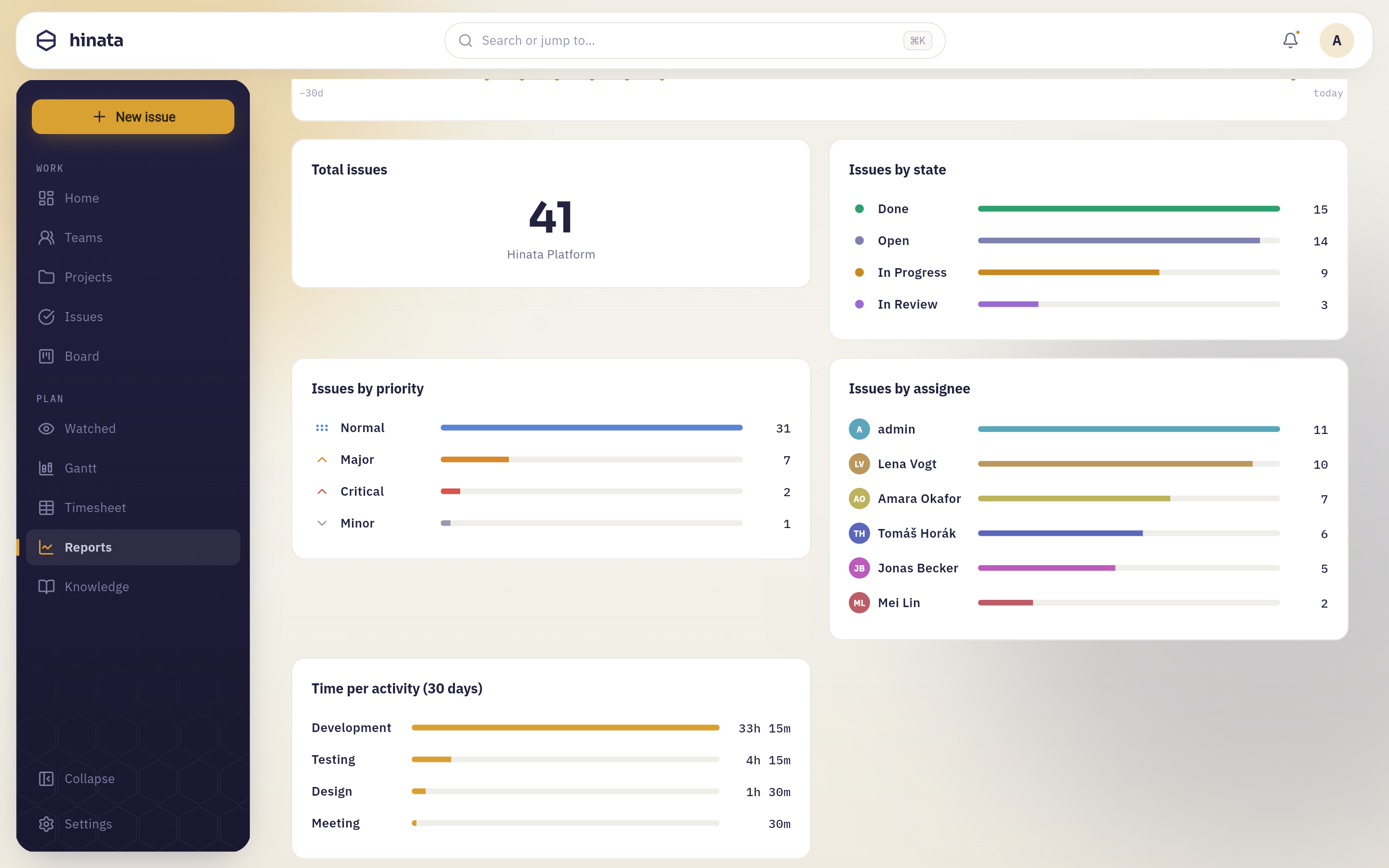 The three cards below the fold: "Issues by priority" with a flag on each row, "Issues by assignee" with an avatar on each row, and "Time per activity (30 days)", whose bars are durations rather than counts.
Read priority as a proportion rather than a count: if most of the project is flagged urgent, the flag has stopped carrying information, and what that calls for is a triage pass rather than a bigger team.
Issues by assignee#
Issues nobody owns are collected under unassigned — usually the most interesting row on the card, because unowned work is work nobody is going to finish by accident.
Counting issues is not measuring effort
Every distribution here counts issues, and issues are not the same size. A person with twelve tiny bugs outranks a person carrying one three-week migration on every one of these charts. Use them to spot shapes — a pile-up, an empty column, an unowned heap — and use a conversation to interpret them.
Time per activity (30 days)#
Everyone's logged work on this project over the last 30 days, added up per activity type. It only contains work that people entered as time entries; time recorded through a Git commit does not reach it.
Sprint burndown and velocity live on the board#
The reports page is project-wide and time-boxed to 30 days. The sprint-shaped metrics — the sprint burndown, velocity across finished sprints, average velocity, scope changes and the work breakdown by assignee — live on the Insights tab of the board itself, next to Planning and Active sprint. See Boards & sprints.
Reading any of this honestly#
A handful of habits that stop a dashboard from becoming decoration:
- Check what the window is. The burndown and the activity breakdown cover 30 days; the team ranking covers 30 days; the distributions cover all time. A project that changed direction two months ago will look inconsistent across them, and that is the charts being right.
- Charts inherit your workflow. "Issues by state" is only as meaningful as your states. If everything sits in a single vague In Progress, no report can invent the detail — that is a project settings conversation.
- Look for the missing bar. An assignee with no bar, a state with no issues, a day with no logged time — absences carry as much information as spikes.
- Never present a number without the question it answers. "Fourteen issues are In Review" is an observation. "Fourteen issues are In Review because one person does every review" is something a team can act on.
Exporting a report#
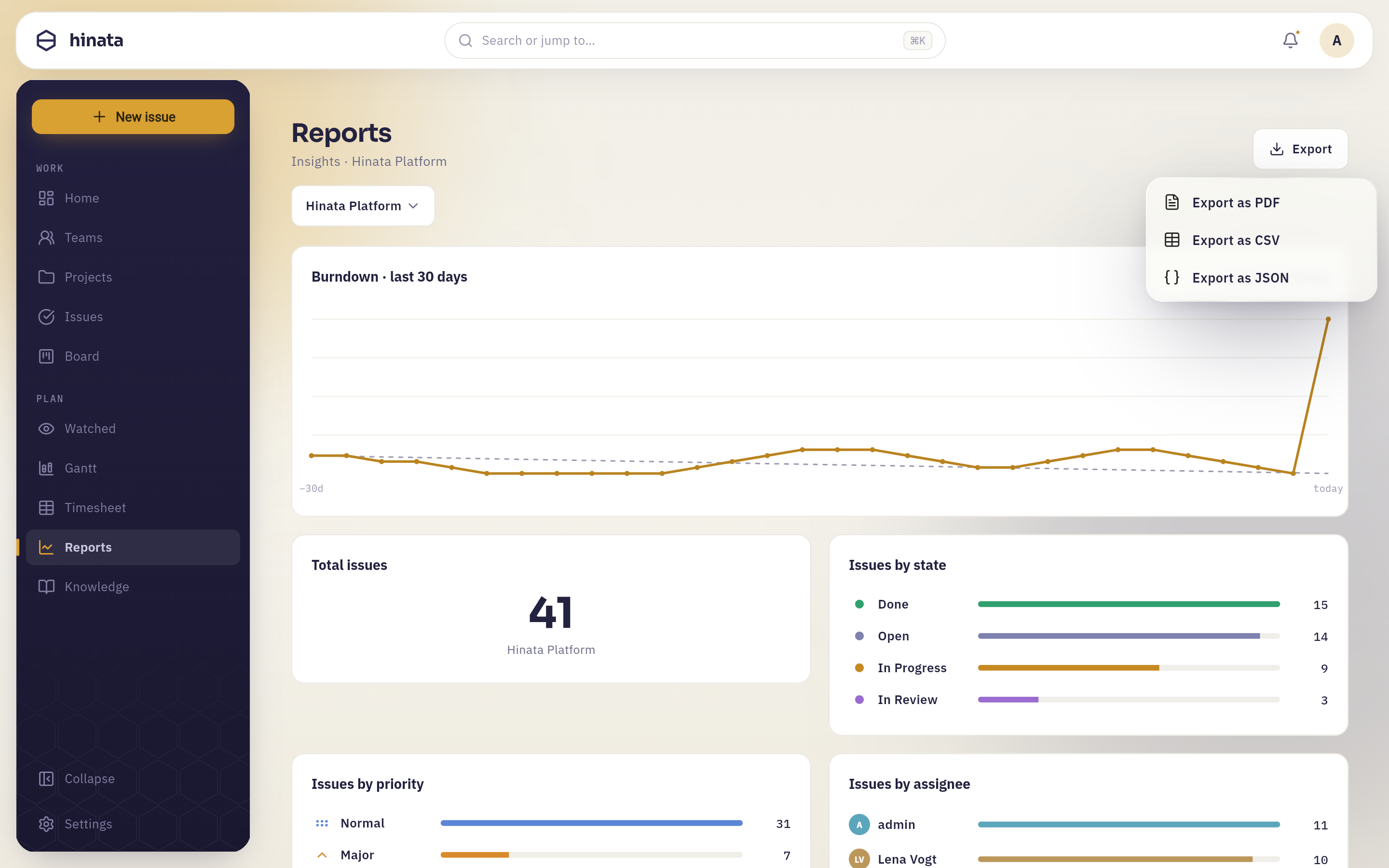 "Export" in the top-right opens three choices: "Export as PDF", "Export as CSV" and "Export as JSON". Each covers the project currently on screen, not all of them.
Export as PDF builds a printable A4 document from what you are looking at:
your organisation's name and logo at the top, the project name, a generated-at
timestamp, the total issue count, the burndown chart, and every breakdown card
as a table of labels and values — including the time-per-activity durations.
Pages are numbered in the footer. It arrives through your platform's normal
share or save dialog, named like hinata-report-Website-Relaunch-2026-08-20.pdf,
so it is ready to attach to a mail or drop into a steering pack without renaming.
Export as CSV and Export as JSON give you the same numbers as data, for a spreadsheet or a script. In the web app they open as a download; in the desktop and mobile apps they are copied to your clipboard, and a toast confirms it — so paste, rather than looking in a downloads folder.
Export the moment you present
Every export is a snapshot with the generation time printed on it. Export it at the moment you are going to talk about it, and the version in the meeting and the version on screen will agree.
Reports show what you can see
The reports you can build are bounded by the same visibility rules as the rest of the app. See Projects & teams.
Next steps#
- Improve the inputs: keep issues in accurate states and give them owners.
- Feed the effort numbers by tracking your time.
- Get sprint-level metrics from the Insights tab in Boards & sprints.